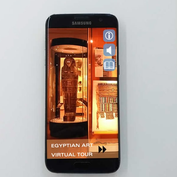
Museum Apps – Exhibition Apps


It has become almost a must-have for a museum to have its apps. This is an attempt to improve the visitor experience and engagement. However, the question is whether the museum should spend its limited funds on expensive apps. Or should they invest in, for example, better lighting to display their collections and objects? It’s a difficult decision, for sure. One must also wonder to what extent museum Apps bring history to life.
In addition, with every passing day, visitors are undoubtedly carrying around powerful computers and interactive devices. These are predominantly in the form of smartphones, iPhones, and tablets. As I write this, my smartphone is likely connecting with who-knows-who, checking the weather, etc. Yes, of course, if you have a budget that allows you to provide a high-quality museum visitor engagement in both reality and virtual form, then there’s no question that these little interactive devices can provide additional information. Thus, if these are used well, like any tool, they will improve the visitor experience.
Recently, I have been exploring museum apps and have been amazed at their significant improvements over recent years. From traditional museum audio tour app guides to immersive multimedia experiences, these museum apps have greatly enhanced the overall visitor experience. I’m particularly enamoured with the augmented reality (AR) features that have allowed me to interact with the exhibits in new ways. AR is a technology that overlays digital information into the real world. This provides users with a real-time mix of virtual and virtual worlds. Using technology, such as AR and others, to bring history and art to life is fascinating, and I look forward to seeing innovations in this area.
But if you are not fortunate enough to have the budget, surely it would be better to focus on displaying objects and making storylines come to life with high-quality interpretation first?
For example, on many occasions, when designing a museum exhibition, the first thing a client will cut if there is not a sufficient budget will be the lighting. They will first question the number of fittings per track but never consider dropping “the app.”
As I have previously said, looking at museum exhibitions that have been poorly presented (unfortunate interpretation with bad museum lighting design) is a bit like drinking fine wine from a plastic beaker. You will soon realise that the ingredients are the same, but the enjoyment is vastly reduced. If the museum design, lighting, and supporting information are of high quality, you can add the icing to the cake by introducing museum apps, not the other way around.
One to watch (or not)
Visitors to a museum are immersed in the subject and inspired to learn. It is also interesting to watch people interact with apps. Indeed, they are sometimes more amazed by the app than the object before them.
As a cultural and visitor engagement catalyst, I am curious to discover how many of these museum apps will be used over the next ten years and to what depth. Tracking will provide fascinating insights into their usage, both while enjoying the museum exhibits and once visitors have left. Will the app reduce or increase visitor numbers if they visit the museum? Virtual visits without the emotional connection of visiting the museum, no sense of scale or smell, etc. Another one to watch is the implementation of artificial intelligence in exhibitions and museums. This digital data (not so) newbie is already changing the visitor experience landscape in many ways; this is exciting to watch!
