ONE OF BRITAIN’S GREATEST LANDMARKS
Exhibition Concept Design Workshop for Blenheim Palace
Blenheim Palace is one of Britain’s most prominent landmarks and among the most visited locations, receiving over 950,000 people annually. It is the birthplace of Winston Churchill and the seat of the Duke of Marlborough since the 1700s.
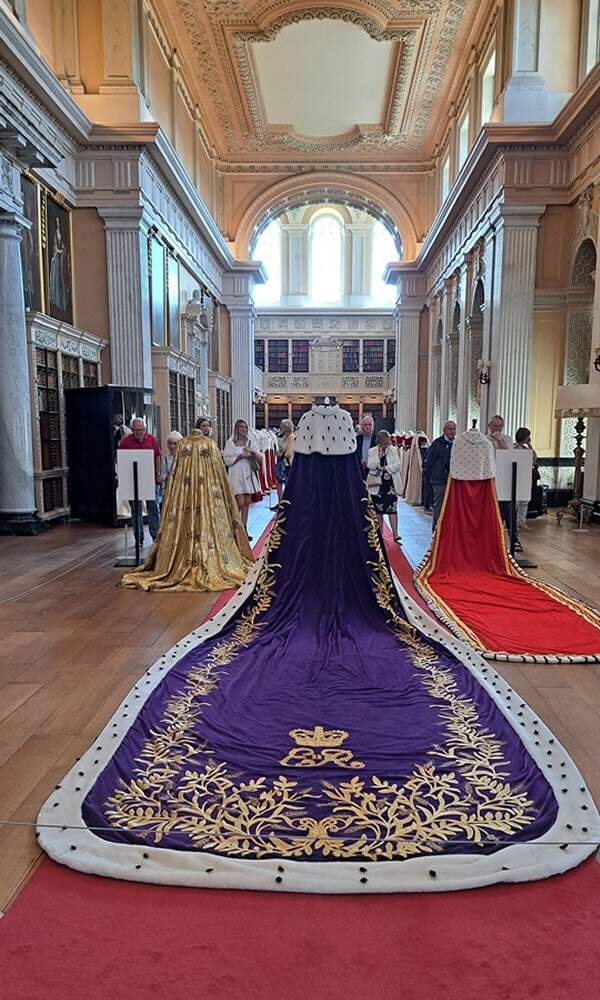
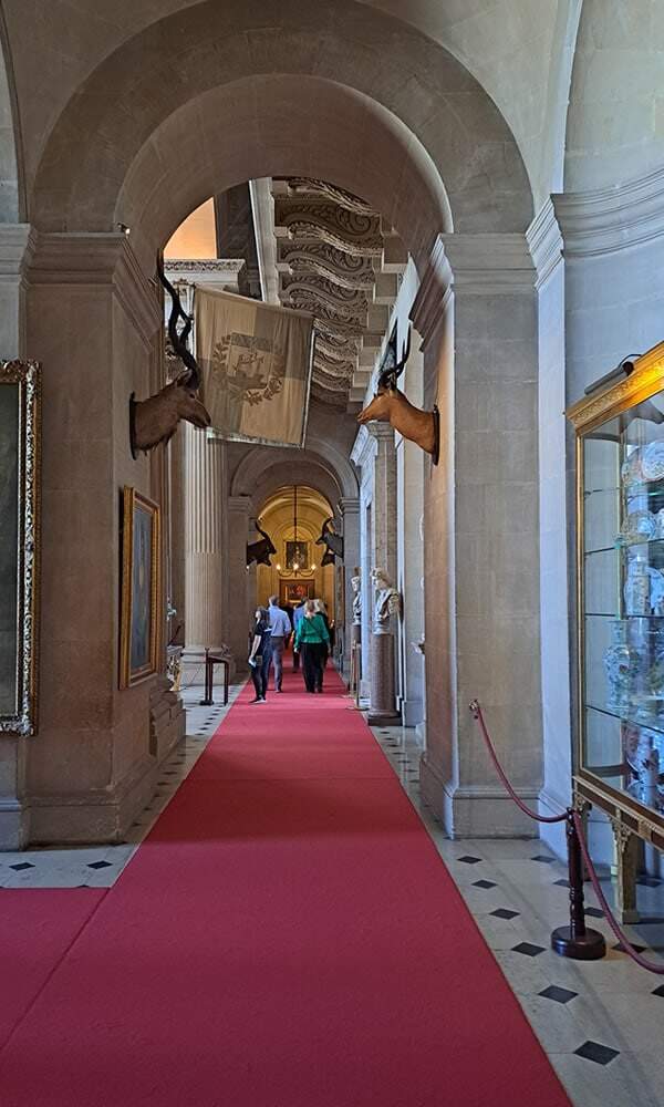
Blenheim Palace already provides a magnificent visitor experience with its staterooms, long library, masterpiece paintings, sculptures and furniture. However, the Blenheim Place trustees, curatorial and operational team realised via research and visitor feedback that there was a considerable lack of historical narrative surrounding the palace’s creation and the people living there. For example, why is it called Blenheim Palace when, in fact, it was originally called Blenheim Castle?
Our exhibition designers were contacted by the Blenheim Palace operational team, who provided a basic brief from which to develop a suite of four rooms into an exciting exhibit.
We started the exhibit design project with an initial consultation visit. During this visit, we met with interested parties and together walked through the available spaces. The experience was enlightening, as the curatorial and management teams shared valuable information with us regarding their reservations, considerations, and restrictions (Blenheim Palace is a Grade 1 listed building), all to ensure the exhibit design would be as inspiring as the palace itself.
Walking through the four rooms allowed us to understand better the scale of the exhibit and the building architecture and get a feel for how visitors might interact with the displays, while simultaneously visualising potential exhibition concept design ideas for the heritage and curatorial team to consider. Our clients always find these consultations invaluable, as they uncover unknowns that lay hidden, hadn’t been thought of, or require further investigation.
Following the consultation, it was agreed that the next step would be to conduct on-site exhibit workshops, including curators, operational staff, and historians.


Exhibit Design Process
Typically, we would use a 3D physical model for this next stage, but there was not enough time to build it as time was limited. So at the workshop’s core was a large-scale printed floor plan, which we placed a one-meter grid across to provide an instant understanding of scale for those participating. It was beneficial that we could conduct the exhibition concept design workshop in the rooms themselves, making the task more straightforward for everyone to visualise.
The Palace lacked historical information, with over 300 years of extraordinary history to unfold. However, presenting all the historical data at once can be overwhelming. Therefore, the team had to carefully select the most meaningful stories and physical items that could support these historical gems.
Fortunately, as part of the assembled team, there were people whose passion and knowledge about the palace and its occupants soon highlighted their favourite stories. Of course, there was still too much information for the available space, but it was a good starting point to start the concept exhibit layout.
As the exhibition design concept progressed, each element and historical reference was tested to see if it worked well in the display and for historical chronological order. Once provisionally agreed, a number was provided, marked on the floor plan, and supporting notes were recorded.
In essence, the rooms used various coloured timelines running on the left and right-hand sides to allow visitors to simply understand the people’s history at the heart of building the palace, followed by the building’s history. Captivating stories and special objects, including uniforms, crowns, intimate letters, architectural drawings, and documents, supported these timelines.
One particular difficulty to overcome in the design was the narrowness of the rooms and the high levels of visitor flow. From the moment visitors enter the palace, they are steered in one direction, so it was paramount to the operational team that the design didn’t create bottlenecks in the exhibit displays. So the most important stories or objects were placed away from doorways leading to the next room, keeping visitors moving.
Once each of the four exhibit areas was resolved and the exhibit design workshop was completed, our exhibit designers produced drawings of the exhibit design layout. This included everything in the design being labelled and drawn to scale for the trustees to comment on and finally approve.

