Top 10 Tips for Designing Exhibition Graphics
How do you design great exhibition graphics? Here are our top tips:
Before starting your design, you should have a clear understanding of who your target audience is. Consider factors such as age, gender, interests, and education level. This information will help you tailor your design to their needs and preferences.
When designing exhibition graphics, you should ensure the designs are inviting, engaging, and visually appealing. By doing this you will grab your visitor’s attention. Bright colours and bold graphics can help draw people in and make them want to explore more about your exhibition.
It is also noteworthy that, for colour-blind people, colours have good light and dark contrast; therefore, if possible, comparable colours should not be used.
You should use these in inspiring ways to capture your audience’s attention, thus cleverly inviting the visitors to learn and explore beyond.
Designing engaging eye-catching visuals that maximise communication and connection.
When you are designing exhibition graphics or museum graphics, keep the following tips in mind:
- For the partially sighted, sans-serif fonts such as Arial or Helvetica are easier to read.
- Use different font sizes, but nothing smaller than 12 pt on labels.
- Use at least 18 pt. on graphic panels.
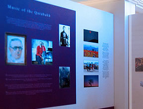
- The text must contrast sufficiently with the background.
- Avoid too much text-heavy copy.
Furthermore, your text should be comfortable to read from a distance. Use a font that is large enough to be seen from across the room and ensure that there is enough contrast between the text and background to make it comfortable to read.
If possible, use images that appeal to and relate to everyone. People learn more in-depth when they can relate to the subject.
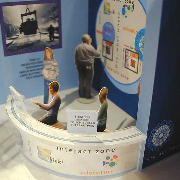
Interactive elements can help to engage your audience and make your exhibit more memorable. Consider incorporating touchscreens, virtual reality experiences, live displays (visual and textual) or other interactive elements to make your exhibit more inviting.
When designing your exhibition graphics, it’s important to think about the hierarchy of information. The most important details should be highlighted and given prominence, while less important information can be presented in a smaller font or a less prominent location.
Choose your materials wisely, as they will affect the cost, quality, and longevity of your graphics. Keep the following in mind:
-
- You should consider how long the graphics are going to be on display.
- Will they be handled or touched by visitors?
- As this will shorten their life expectancy.
- Cleaning has been particularly essential since COVID-19.
- How will these graphics be fixed in your exhibitions? This is important to take into account when laying out your designs.
Lastly, you should carefully consider the appropriate lighting of graphics;
-
- Avoid hot spots of light and shadows. An even wash of light is better.
- The warm temperature of light of 2700 Kelvin (K) to 3000 K is less harsh on the eyes, but the cooler 4000 K to 6000 K will provide a more fresh and contemporary feel.
- Light levels (Lux) should be carefully considered, as low light levels make it more difficult for the visually impaired to read text.
Designing Exhibition Graphics
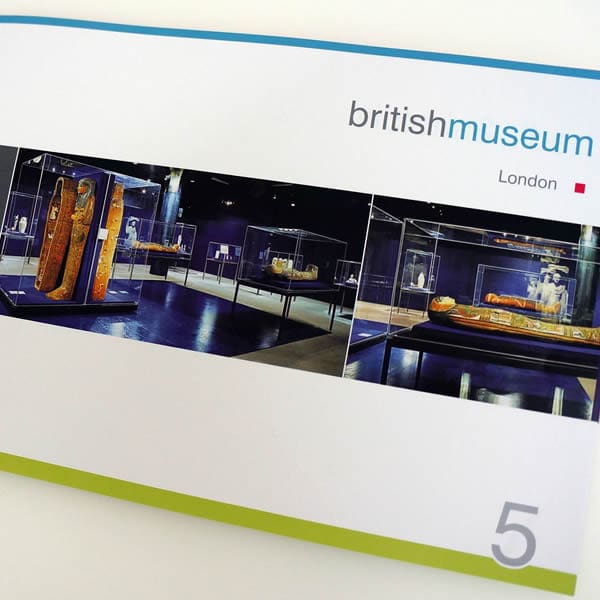


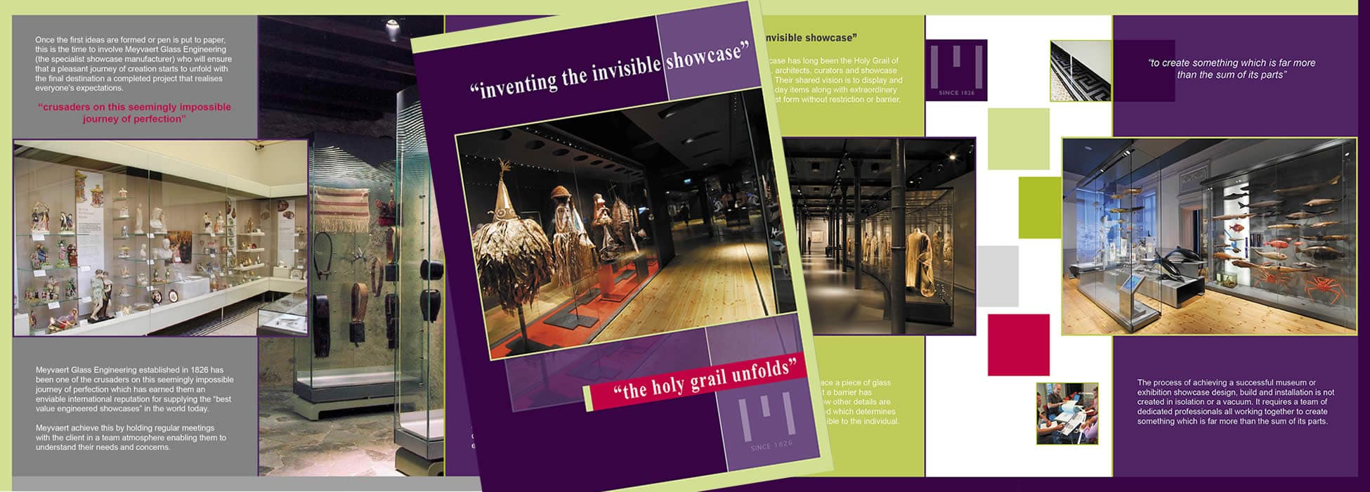

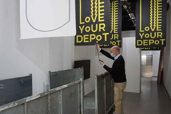

Of course, these are merely some of the essential elements to consider when successfully designing exhibition graphics. Whether you are creating graphics for a museum, exhibit, art gallery, or commercial exhibition, these “in a nutshell” top tips will set your design cogs in motion. 11th bonus tip: Have fun designing!
author: Tamara De Schepper

