Top 5 Tips for Innovative Museum Exhibition Design
We have all been to museum exhibitions where exceptional pieces are lost amongst the white noise of larger objects, paintings, photographs, or simply too much interpretation. This can be due to various reasons. Some of these causes could be their size, the number of items in the collection, and, primarily, how they have been presented. Therefore objects must be displayed innovatively so individuals do not overlook them based on their perception of significance.
There are numerous methods that, with a pinch of imagination and an innovative approach to layout display, can fix this. Below are the top five tips for innovative museum exhibition design. These tips ensure we will give these unnoticed items the focused attention they deserve. These design top tips can work even if the objects are somewhat less imperative, as long as the storyline behind them is powerful enough to pivot on their presence.
How do you design innovative museum exhibitions?
1. Empower & Engage
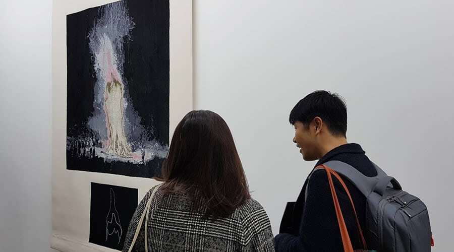
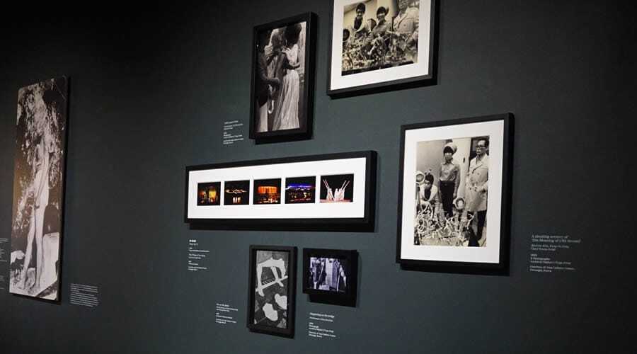
You can single out an image from a collection of photographic images and display it on its wall or space, drawing in visual-focused attention. One of the most common ways to display photographic images is to present them in almost indistinguishable frames and mounts, as well as in long lines. These photographs may be displayed at various heights, grouped chronologically by subject or storyline.
The frames can either enforce the subject or lessen its influence. There is nothing wrong with this display methodology, and frequently, it works very well indeed. Nonetheless, if you alter some of the monotonous display parameters and mix things up a little, the visitor may visually connect and stop. Consequently, they will spend additional time examining each photograph to appreciate its merits. Moreover, by empowering the image and invigorating the exhibition, the audience enjoys a more informative and engaging experience.

Curious & Curiouser
The mounting card is another medium that needs to be carefully chosen to complement the images. It can be quite striking to have a small image in the middle of a large frame with the right proportions. Next, the positioning of the illustration or artefact is also a factor to keep in mind. Unusual locations can catch the audience’s eye and encourage them to inspect the object from a different perspective. For example, displaying one image is much lower than the other images and not centred. This is especially effective if there is just one image hung on the wall, breaking that visual mould.
We should consider the essential “access for all” criteria for those of different heights and with less mobility. Your objective is to make the visitor think WHY these are displayed in such an extraordinary way. Curiouser and curiouser design elements invite the visitor to explore the hidden story. Yes, compelling stories within a story can be discovered by those who dig deeper.
Portraying Prominence
An alternative method of accomplishing innovative museum exhibition design is to create an individual wall or column-like structure. Depending on the exhibition design and layout requirements, these can have two or more-sided surfaces.
Conversely, simply placing one photographic image on each of the faces of the wall focuses the visitors’ attention exclusively on this. This gives the image prominence and allows it to be observed effectively. This can be beneficial when a museum exhibition becomes busier, and sightlines are obstructed. You must be careful, though, as this methodology should be implemented with “less is more” in mind. The repetitiveness of something special will swiftly result in the exhibit losing effectiveness.
2. Catching Colours
Number two may seem obvious, but changing the colour of the gallery walls has a colossal impact on how artefacts on display are perceived. If you display one wall in a contrasting colour from the rest, it instantly makes a clear statement of intent. With this easy change, you can capture the visitors’ perception and raise their expectations of what is displayed. The sensation in the eye draws them in to take a closer look. Similarly, changing the shape or construction of the wall(s) to create the form of a focal point for the exhibition space can be advantageous. Add some texture or pattern, whether for historical context or aesthetics and presto!
The sheer power of colour is absolute. Different colours can affect the visitors’ behaviour and frame of mind. As a result, colours can alter the visitor’s experience and response along the nerve path. Colours can provoke, heal, and physiologically influence the emotive perspective of an object. For example, green colours may communicate environmentally friendly thoughts and may be unknown to some; these are also the most suitable colours to adopt for the eyes to process the information on display. On the other hand, black, as seen in the picture below, portrays sophistication and power. Black is a popular colour as it is easy to read text in black and white.

Visual Volume
You can also add into the mix the possibility of playing with the volume of the exhibition space that surrounds our objects. This can be done in countless ways. One method is by lowering the height or angle of the ceiling and walls and the material they are made from. Using a stretched cloth ceiling will create a completely different feel and acoustic for that area than that of a traditional plasterboard or MDF equivalent.
Conceivably, you may want to make the space quieter, almost spiritual, compared to the rest of the exhibition. The colour white is often associated with clarity, silence, and light. This we can achieve by adding sound-absorbing materials to surfaces, especially the floor. Moreover, you can combine them with scents to relax and stimulate sensory responses from visitors. These are simple and relatively affordable tips that never break down and consistently deliver.
3. Victorious Vistas
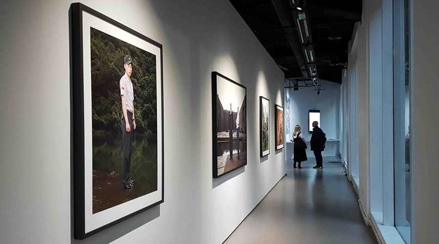
Another innovative top tip is to create magnificent views or vistas of the objects you are displaying. This is a straightforward way to give items real presence and importance.
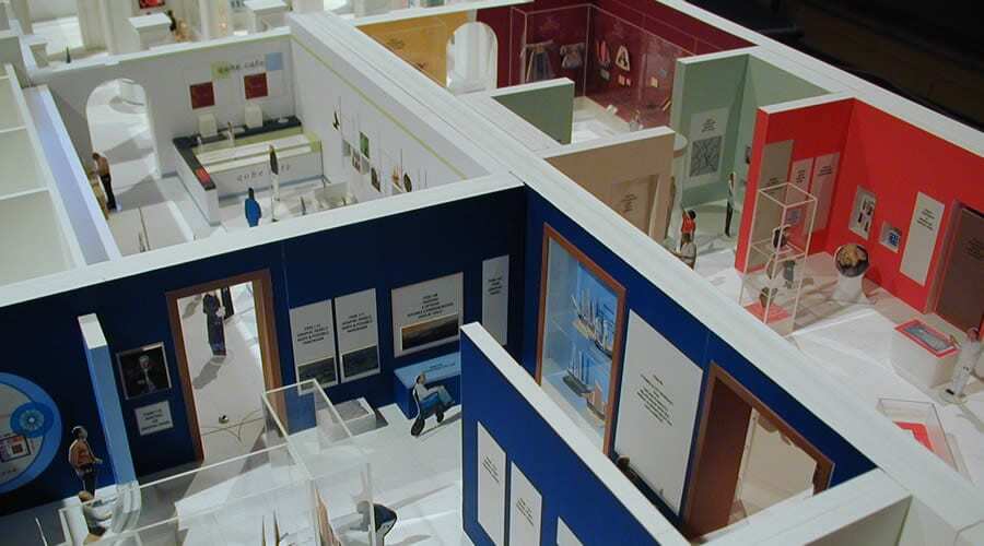
Again, there are several ways to accomplish these goals. One of these is by experimenting with the available spaces within the museum exhibition galleries—certain exhibition designers like to use 3D software to create walkthroughs to test their vistas and designs. Our preferred methodology to develop conceptual exhibits with incredible outlooks is to start with large-scale physical models of the galleries. This ensures a more realistic and open approach to brainstorming design ideas and visual concepts. There is nothing quite like these (further examples), and from experience, they are loved by shareholders and interested parties who can accordingly fully understand the designs without frills. Once the conceptual stage is successful, it can then be generated into 3D walkthroughs for general comment. Whatever method you employ, you need to deliver a design that opens distinct sightlines to these predominant pieces.
These key artefacts are required to be the focal point of each space or gallery. Furthermore, you can add excitement by allowing these items to be glimpsed through an opening or window in an exhibit wall from a previous gallery. This glimpse of what is yet to come builds suspense and anticipation! Most definitely a winner!

4. Mirror Mirror
The use of mirrors in exhibitions is an old trick that has been used for years. Nonetheless, it is still an extremely valuable tool in the museum exhibition designers’ arsenal.
You can use mirrors to make any space look more impressive and spacious. By carefully placing them at strategic locations throughout the galleries, you can alter people’s perceptions.
Mirrors have the power to reveal hidden details about objects in the most extraordinary ways. Take manuscripts, for example, where the audience can now explore both the internal pages and the cover and bindings with ease. This cost-effective solution can be utilised in a myriad of ways in a showcase and exhibition environment to showcase artefacts in the most captivating and effective manner possible.
This innovative top tip is not to be confined to just the galleries. It is correspondingly beneficial to use mirrors in the museum café or gift shop to generate an atmosphere and additional buzz. Remember, no one enjoys facing a wall in a restaurant or café. With the power of “Mirror, Mirror” on the wall, we can all enjoy what is happening behind us and in front of us.
Here are a few more examples:
- It creates a Pepper’s Ghost hologram illusion that always impresses visitors.
- Reflecting light within showcases places internal light fittings cannot reach.
- To illuminate the galleries, diffused reflected natural light is used.
- A low-cost solution allows visitors to recognise their participation in the exhibition or interactives.
5. Luminous Lighting
Lastly, and certainly, not least, innovative museum exhibitions’ top tip number five is light. Changing the way you light an object or piece is an immensely imperative top tip. When executed efficaciously, the results are awe-striking. One must always keep in mind the sensitivity of items. Therefore, you mustn’t abuse the item with too much lighting or conservation lighting.
If you have delicate objects, then you should keep in mind that all light will affect your light-sensitive pieces, even with light levels as low as 50 lux. You should ensure that their exposure is limited by comparing lux levels to the exposure time. Even after saying this, even with low light levels, you can still change how we light the piece to give it a presence within the space.
Furthermore, we can change the shape of the light using framing projectors, barn doors, and lighting filters. All these will have a dramatic effect on the way people interact with the artefacts or pieces. If you have a bronze or stone sculpture, you can flood it with as much light as you like, creating some dramatic shadows on the walls behind it. These generated shadows might be 20 or 50 times bigger than the actual piece.

Temperature & Transformation
Next, the temperature of the light (measured in Kelvin) is also essential to highlight items. You can do this by utilising either cool or warm light sources, while the rest of the exhibition uses the opposite. By using these simple lighting techniques, you can generate a sense of importance for the piece, however small.
By thoughtfully considering the temperature of the light, measured in Kelvin, you have the power to highlight even the smallest of items and imbue them with a sense of importance. With the simple use of cool or warm light sources, in contrast to the rest of the exhibition, you can transform a worthless rusty spoon into what the visitor considers priceless. Remember, it’s the little innovative museum exhibition design details that make all the difference.
Summarising
Whether you utilise some or all of these detailed and innovative museum exhibition tips, you will undoubtedly create genuine significance for the artefacts on display. Moreover, visitors will wander and interact with the museum exhibition space differently. Instead of merely walking around the exhibit as if they were in a supermarket, thus only occasionally stopping to examine a piece, the visitor interaction will positively transform.
Now, they will move from one piece to the next, stopping at each element, knowing that it must have some fundamental importance. Additionally, it will allow them to enjoy its aesthetics while absorbing valuable information and provoking thought. Ultimately, your audience will enjoy an unforgettable visitor experience and connect with the narratives.
You can also check out our 23 tips on designing great museum exhibits if you are still thirsty for more!
author: Tamara De Schepper
